CREATE 2023
Brand Identity
•
Event Design
•
Social Media Marketing
•
Brand Identity • Event Design • Social Media Marketing •
Project Year: 2023
Designers: Brynn Olsen, Autumn Kitabjian, Grace Alderman, Marina Sepe, Sydney Herritt, Vivian Jade Li
Art Direction: Abby Guido
AIGA Baltimore Flux Student Design Finalist, 2024
Each team role was decided upon by our client and professor, Abby Guido, following interviews. This lets team members focus on different aspects of the project and makes it easier for us to work together as a team.
As the copywriter for the team, I was responsible for collecting feedback on our design proposals while we presented them along with keeping track of deadlines. I was also tasked with coming up with all the copy for graphics and captions on Instagram posts.
Marina, as our Lead Strategist, researched similar events and looked into feedback received from previous CREATE events. Sydney, our Production Manager, was responsible for setting up our cloud storage on OneDrive, complete with an organized naming system in place. Our project manager, Vivian, organized what tasks we would need to complete during the project and set deadlines according to progress made from week to week. Grace was responsible for organizing student-submitted work, scheduling 438 reviews, and similar tasks as our Event Planner. Autumn, as our Design Manager, was responsible for collecting and presenting each team member’s design contributions while also leading brainstorming sessions.
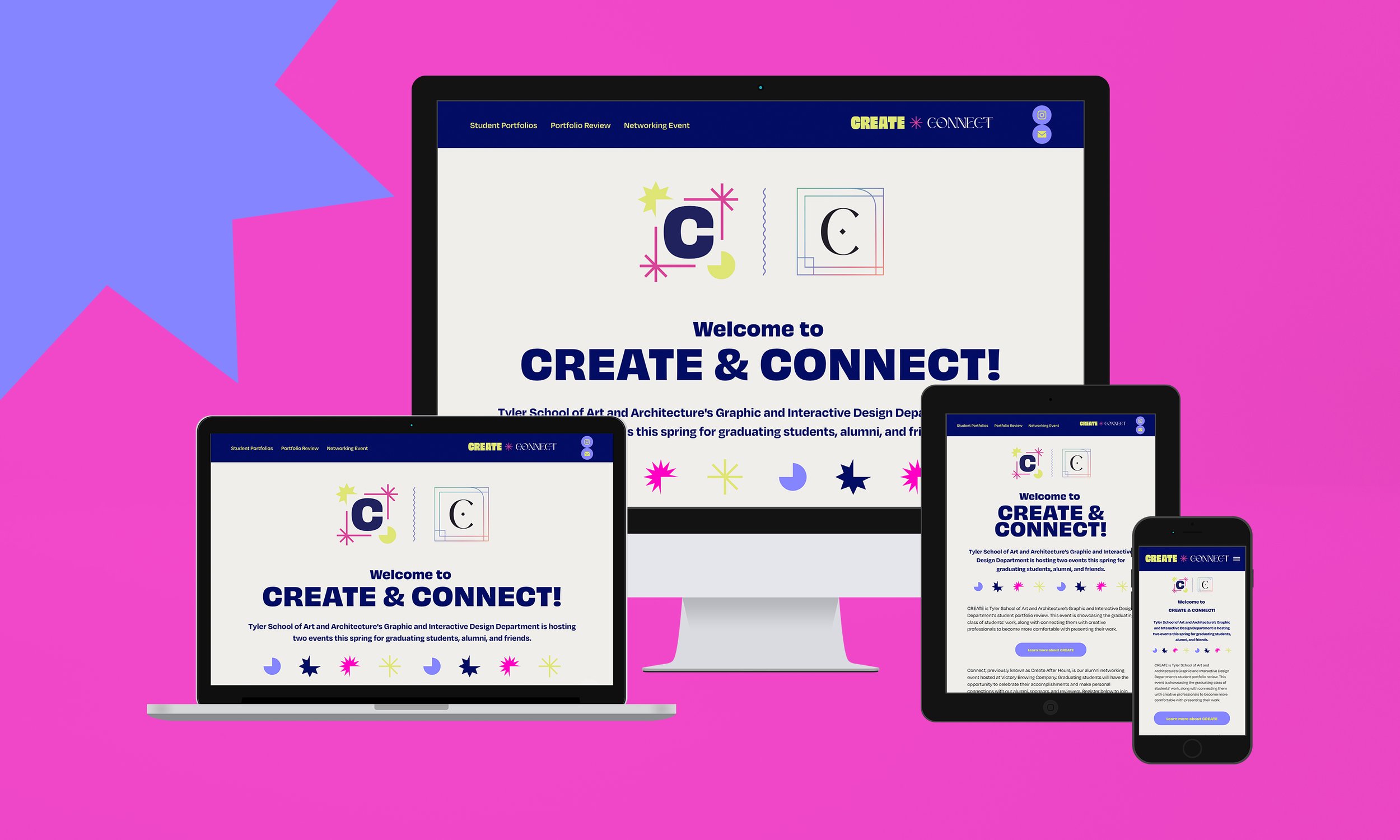
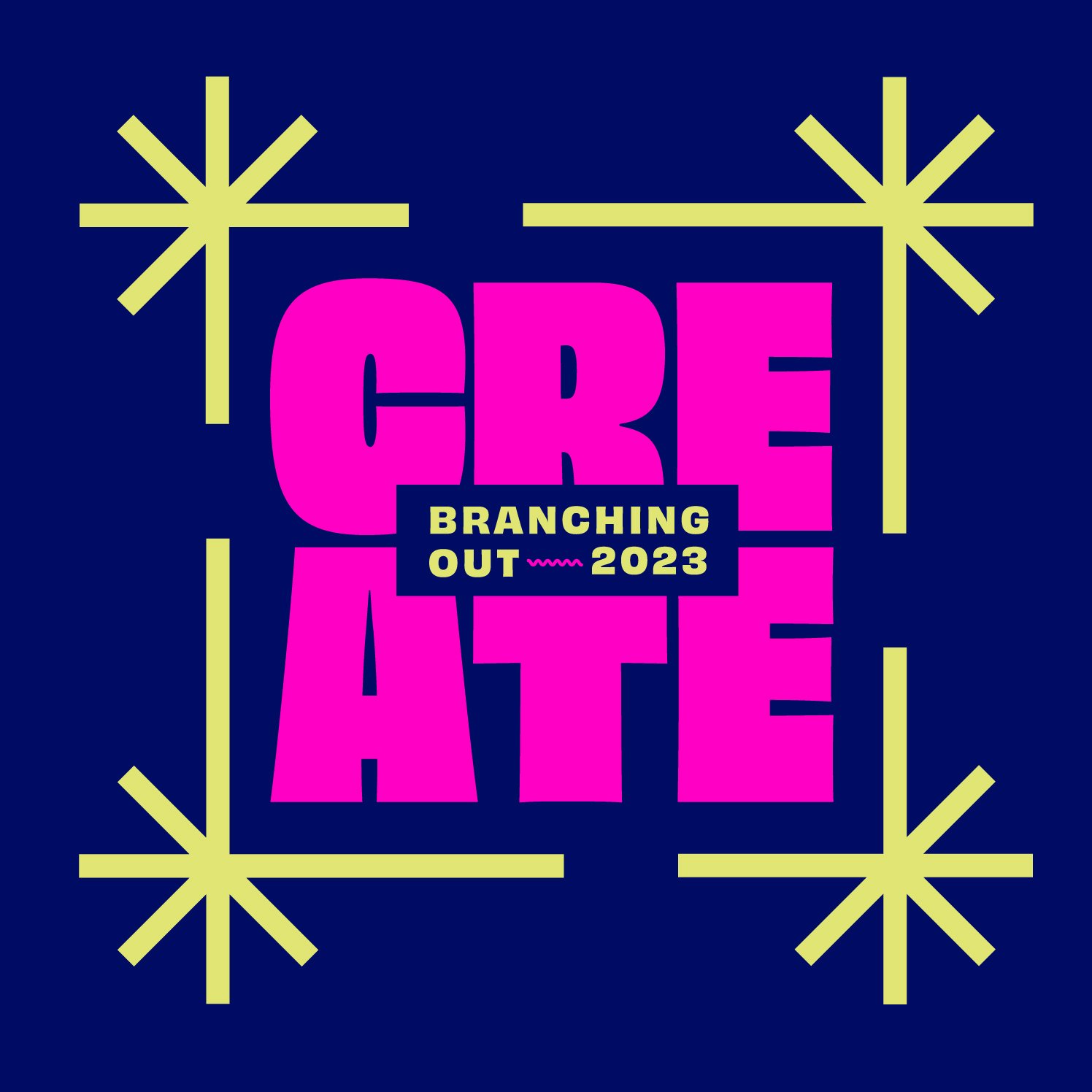
CREATE is Tyler School of Art and Architecture’s virtual graduating portfolio review for the Graphic and Interactive Design department. Our six-person team of students was tasked with creating a visual identity for this event that represents and serves our graduating class. This year’s branding revolves around the theme of “branching out,” which embodies the experience of our students leaving academia, pursuing new careers, and entering the professional world.

In our creative brief, we went over what our goals for this event were. We wanted to create a brand that would catch the attention of alumni and creative professionals and make them excited to engage with the GAID’s 2023 graduating class. We wanted our online campaign to stand out in order to motivate people to participate in the event and interact with students. We also wanted to make it clear that our peers are talented, hardworking individuals eager to begin their careers in the design industry.
At the beginning of this endeavor, Sydney set up our naming conventions and OneDrive cloud-saving system with our team. Vivian and Autumn worked together to create our deadlines for collateral. Marina also began to research with Grace on the design work from past CREATE projects and similar events to set expectations on our scope and what deliverables we would be doing for the rest of the semester.
Logo Design
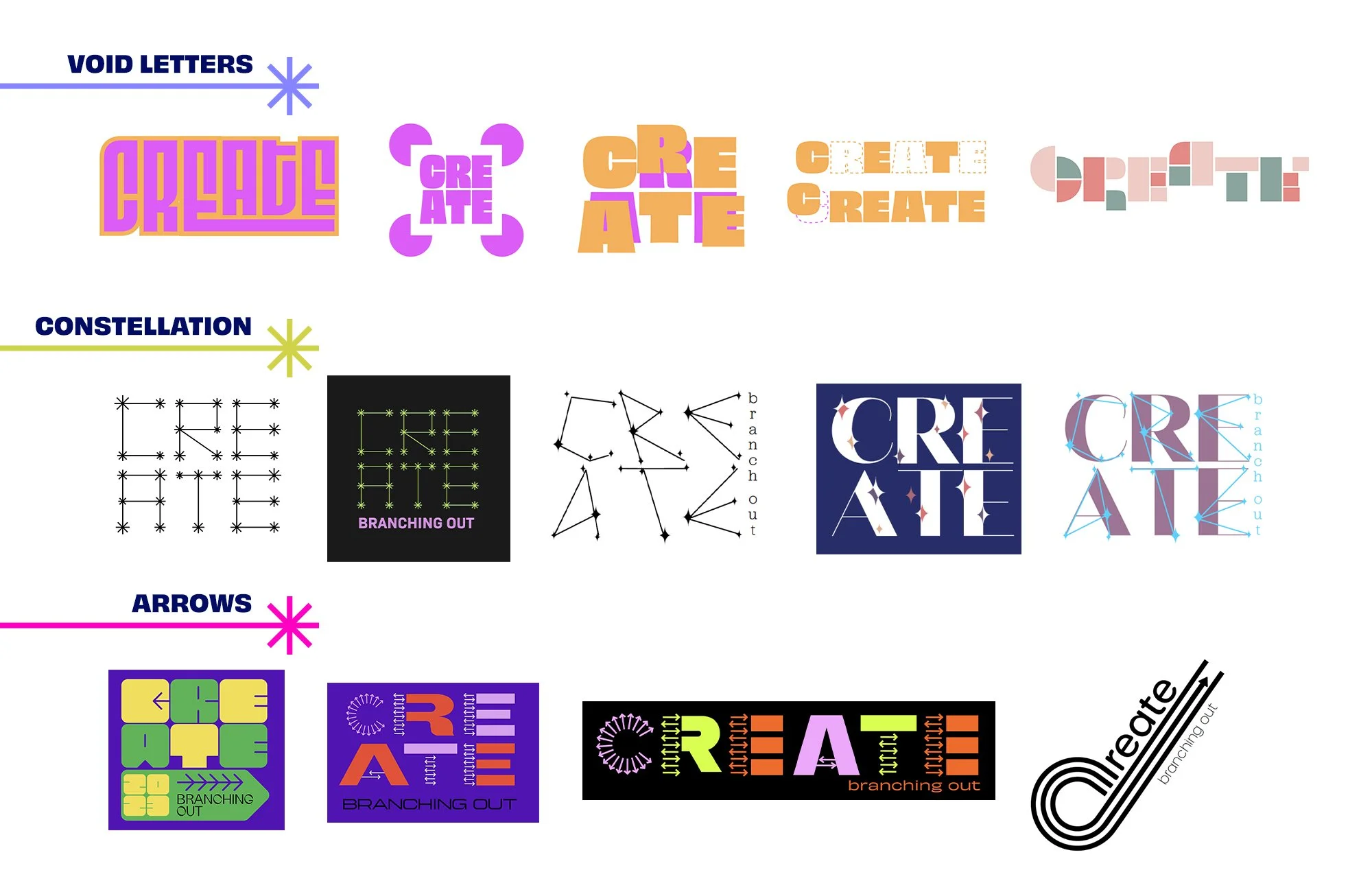
Our first brainstorming session, led by Autumn, largely focused on coming up with different concept ideas. During this process, we talked about what this event meant to the graduating GAID class and what their/our place in the design community is. The initial ideas that emerged from this process were “branching out,” “design in motion,” and “design and conquer.” Our lead strategist, Marina, researched logos with similar concepts or themes and made a presentation for the group to help us get inspiration, which we used to develop these concepts further.
Following this, we broke into groups of three to explore logos that related to each concept before coming back together to discuss what ideas we liked and what we felt were the strongest going forward. After a couple more brainstorming sessions, we settled on our “branching out” concept and focused on logos that conveyed the idea of moving fully into the professional design sphere and expanding our horizons. The three visual concepts that we felt connected to this concept were “void letters,” “constellation text,” and “arrows,” as shown below/above. Our team liked the starburst shapes from our constellation concept and the use of shapes as a frame from a different concept and decided to merge these elements together in order to form a logo that represents both ideas.

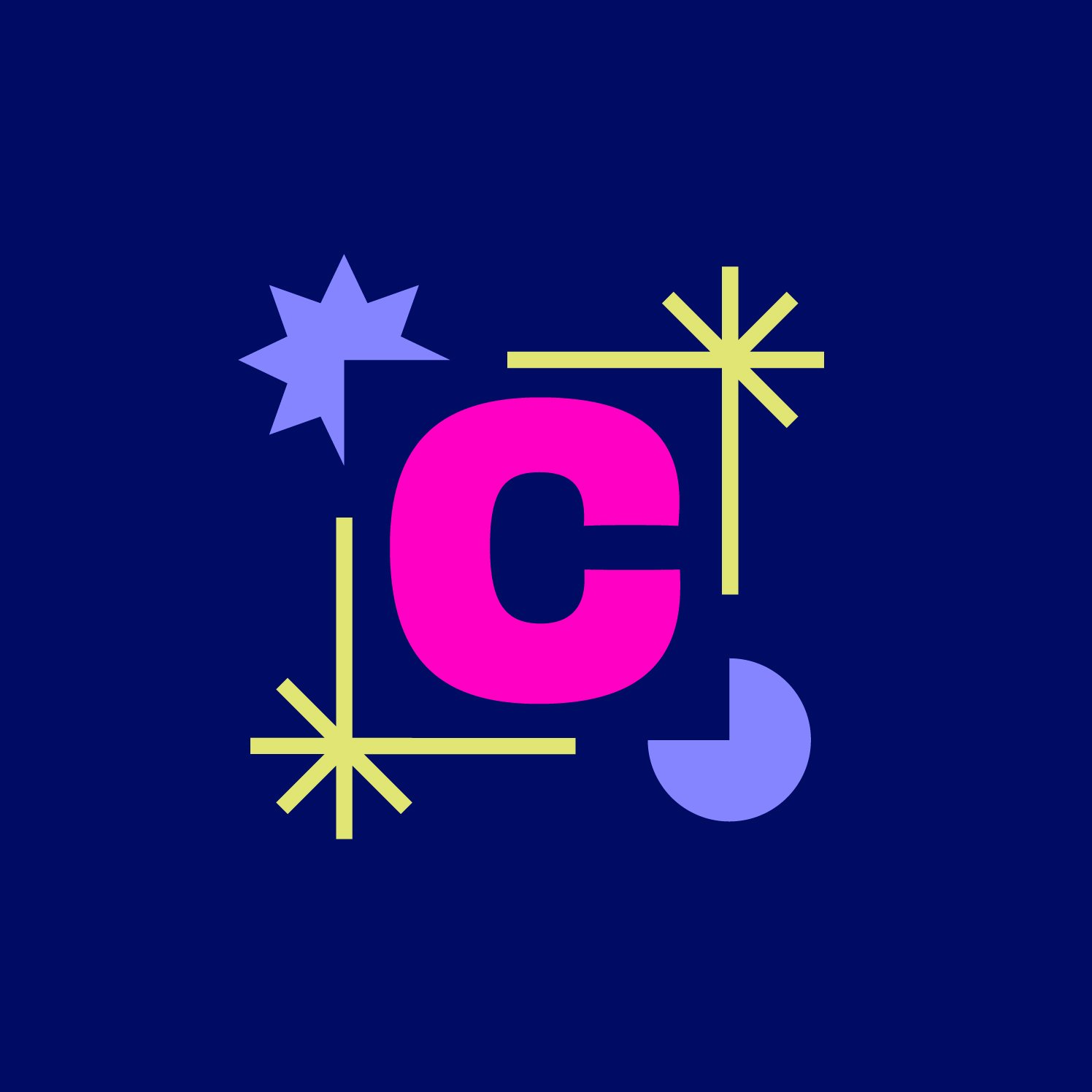

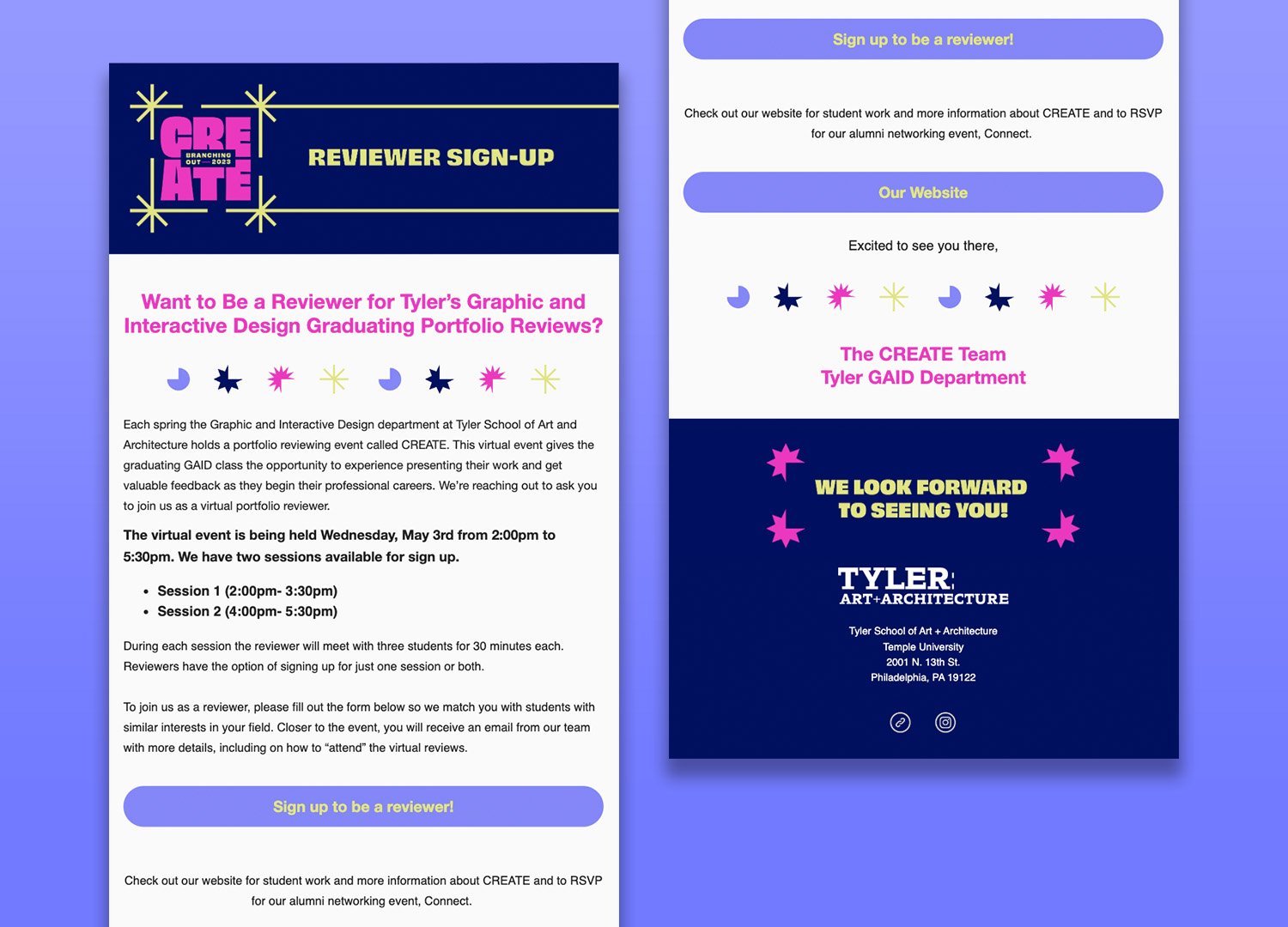
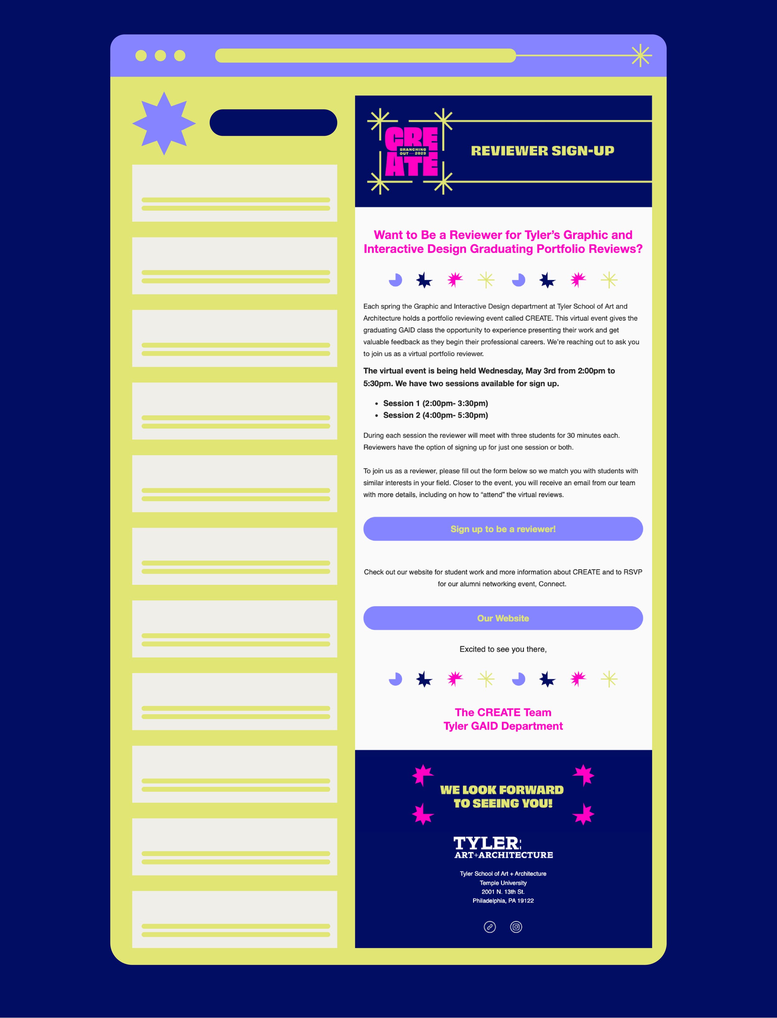
Once we started our collateral elements like our emails, save the date, and website, we further fleshed out our brand and established the important design elements for CREATE’s branding. We fine-tuned our color palette to include bold and more subtle colors that worked well together. It was important to us to establish a balance between eccentricity and subtlety. This was also perpetuated through the usage of chunky, experimental typefaces and simple, delicate typefaces. This culminated in our final style tile.
Photo Treatment
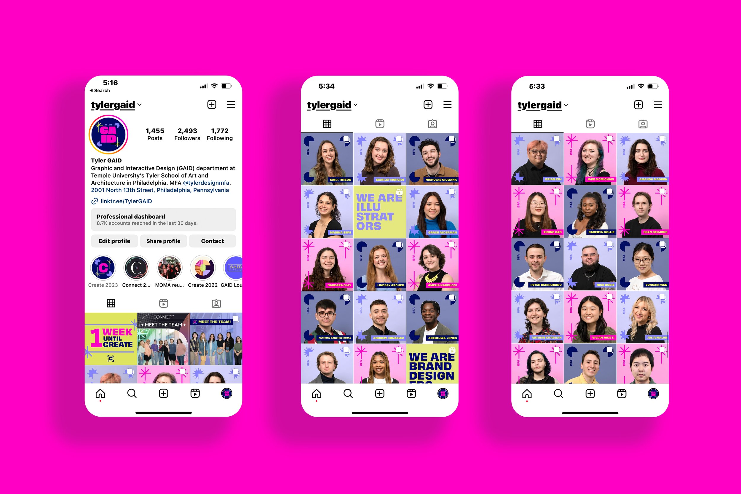
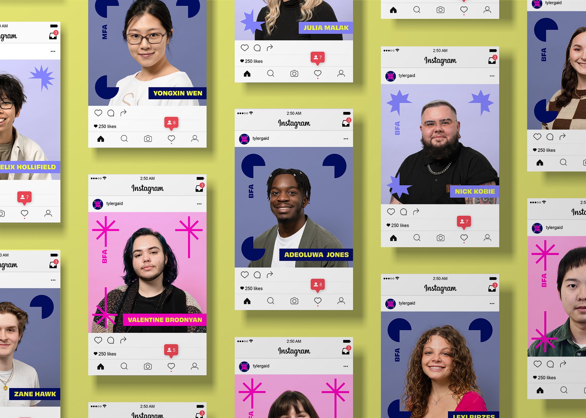
Following finishing up our style tile and initial save the date post, we needed to collect student information and headshots. Grace, our event planner, was responsible for setting up student forms and spreadsheets that collected student work, reviewing preferences, zoom links, bio information, and headshot time slot information. A photo day was held where each team member would track who had gotten their photo taken and ensure they filled out other forms beforehand. Sam Fritch would take professional photos of students before sending the files to the team, where we would edit and stylize the photos according to our brand.
We decided upon a photo treatment that involved a system of four different alternating frame styles. Our shapes accentuate each student in a unique way. We used our lightest color, chartreuse, to accent the students’ names. These posts were carefully crafted to ensure everyone’s name would be optimally readable and fit within the frame structure. The background colors were individually chosen to ensure each student would stand out clearly.


Social Media
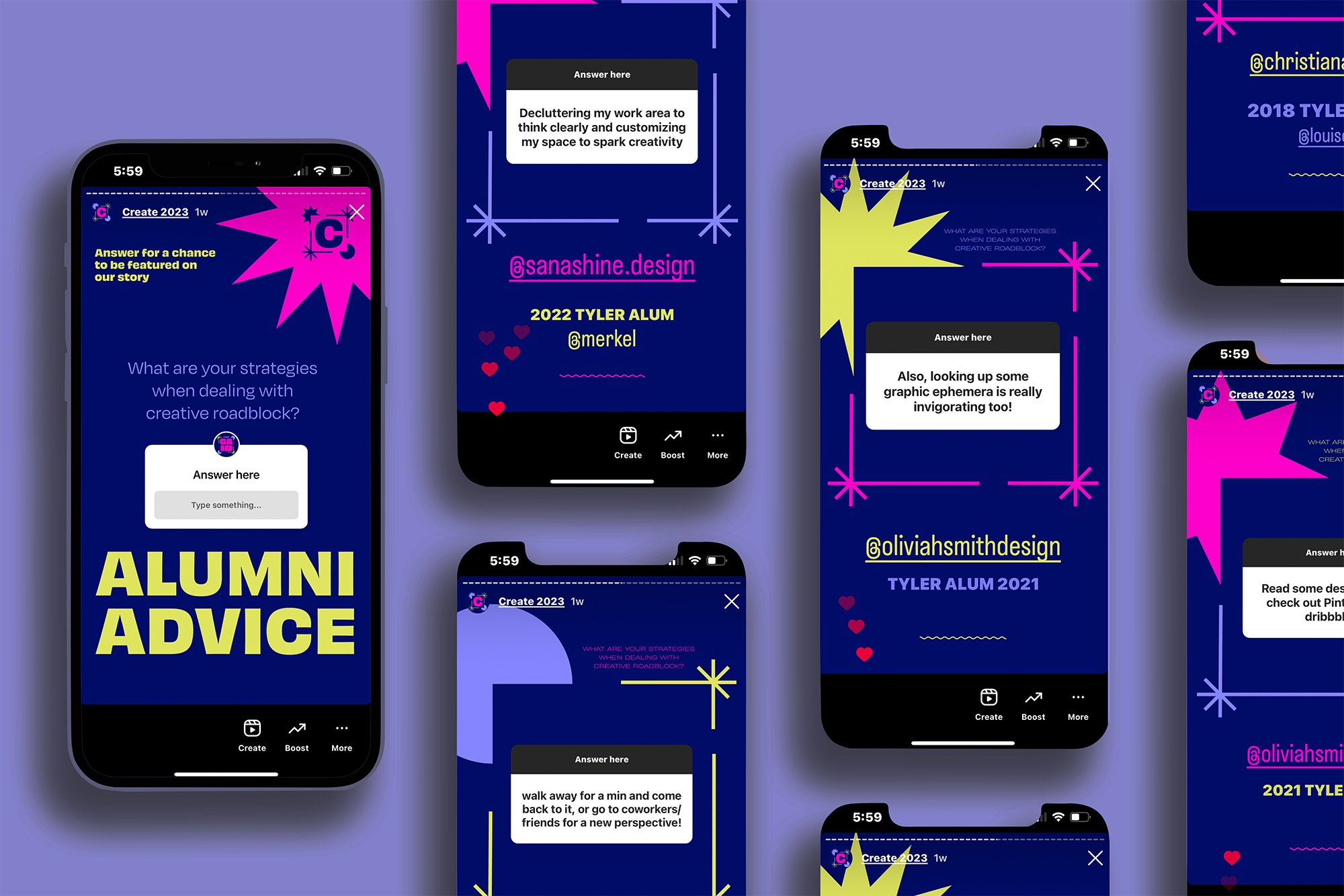
After changing the GAID profile picture on Instagram to our CREATE logo, we began our takeover. After finalizing our photo treatment, collecting all student work, and collaborating with our social media assistant, we planned out a detailed schedule of when each student profile would be uploaded. Each student would have six examples of their work in their post, with their personal bio and tags included. We also planned out our “WE ARE” reels that showcased certain categories of student work such as typography, UX/UI design, poster design, etc. Alongside these planned posts, we came up with various interactive story posts such as “Alumni Advice” and “This or That” segments that would be uploaded to get more engagement. As we got closer to our event, we posted reminders to build excitement and assure that our reviewers were on board.
Our team also used MailChimp, where we would set up branded emails to further reach out to potential reviewers for the virtual portfolio event. After collecting all this information, the team had to do the undertaking personally matching students to reviewers based on the time slots available and interests or specialties listed.


Conclusion
The project was a success through effective communication, planning, and design work done by our team. The end result was a campaign that was loved and embraced not only by our graduating class but by the expansive audience we were able to captivate on social media. We had a total of 137 reviewers sign up for our event, meaning all our participating students could meet with six reviewers as we had hoped. In fact, we had so many people sign up that we had to group up individuals from similar companies. Overall, we grew tremendously as designers and team members by working together to create a memorable and cohesive visual identity and strategically implementing it throughout multiple clients. By supporting each other through creative and technical problems, we were able to construct a successful campaign that went above and beyond.