Pawsitivity
UX/UI
•
Web Design
•
Brand Identity
•
UX/UI • Web Design • Brand Identity •
Project Year: 2023
Designer: Brynn Olsen
Art Direction: Matthew McGlynn
Pawsitivity is an imaginary adoption website that also offers pet “rental” services. My goal was to make an adoption site that was both user friendly and well designed, as a lot of shelters unfortunately have poor user interfaces and little branding or design. View the figma file here.

Site Mapping and Flow
After figuring out my persona and branding, I started figuring out what I needed for my website and how I wanted everything to connect through making a sitemap. I went back to my research notes and noted down things that all of the previous websites had along with some obvious things (homepage, search page, reservation page, about, etc). I then figured out how each page would connect to the next and how the user would want them connected.
Another important part of the process was figuring out what my user flow was, what was my users start and end point? How did I imagine by user getting there? This helped me prioritize what pages I needed for the website, since if the user wouldn’t use it in the flow it wasn’t super worthwhile in the prototype. It also helped me put myself in the mindset of the user and think about what would be convenient layout wise.

Figma and Prototyping
This project was my first experience really deep diving into using Figma after using Adobe XD prior. Overall, when I was just getting started into using the program it felt very similar to what I was used to. I set up my initial wireframes and really got into figuring out my exact flow, page layouts, and how to incorporate my initial branding into my UI. A fun challenge I had was trying to do a small loading screen animation, which took some trial and error just to figure out the limits and process behind smart animating.
There were a couple hiccups in utilizing this program to the best of my ability, for example I only figured out I could have multiple pages to separate my work much later in the process. I also realized just how important it was to keep my visual elements organized later as well when I went to see my prototype and realized elements were on the wrong layers. I also had a peer accidentally delete my file when I gave them editing permissions so they could show me some prototyping tricks they were using for animation, and subsequently learned how to restore a deleted file on Figma. All of these experiences have been really integral in better understanding this program and developing better work practices for the future.
Final Thoughts
Pawsitivity was a very fun project to work, I enjoyed coming up with the brand just as much as I enjoyed setting up all my art boards in Figma. I also feel I learned a lot in this process when it came to consumer/ user considerations when trying to make an effective product through my research and peer testing. In the future, I look forward to working on similar projects and maybe I’ll finally figure out how to effectively make a side scrolling carousel prototype.
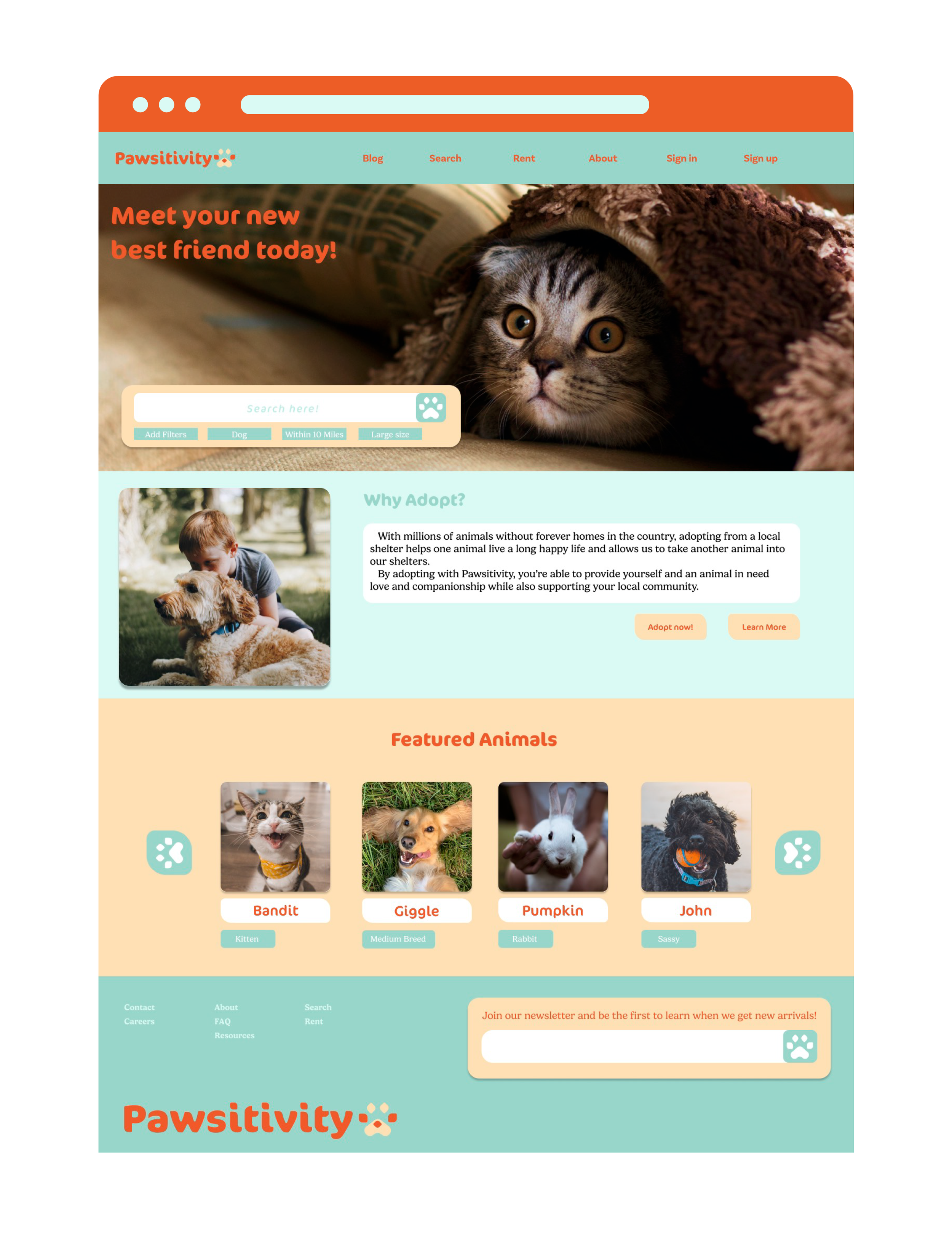
Purpose
Adoption websites are a great way to take some first steps into getting a new pet. They allow people who aren’t sure about adopting or have too much time to search around shelters for the perfect companion to quickly find animals that match their needs. Unfortunately, a lot of shelters don’t have the time or resources to invest in a good website that showcases their animals and makes it easy for potential adopters to find them. This project was about exploring what a solution could be to those issues.
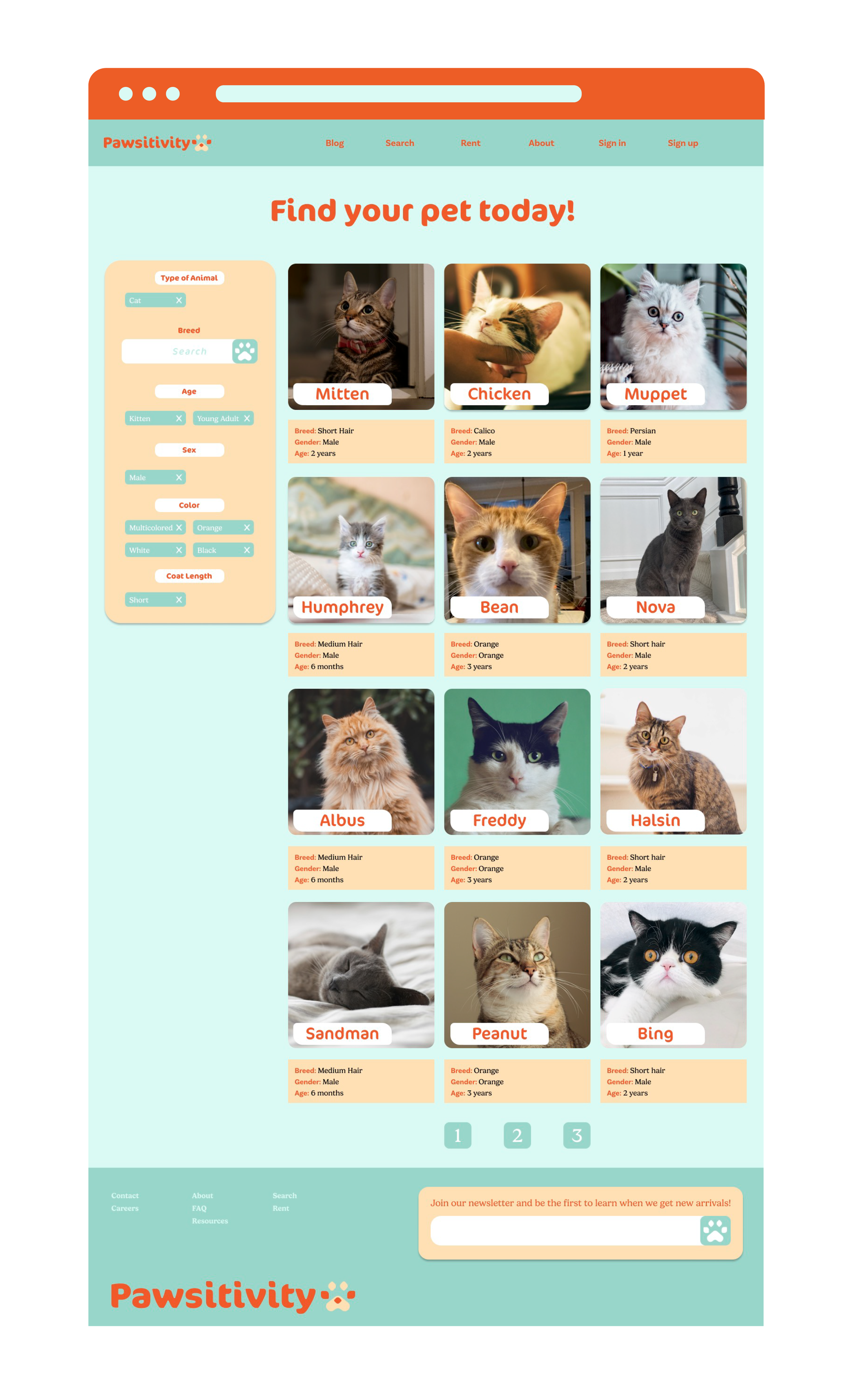
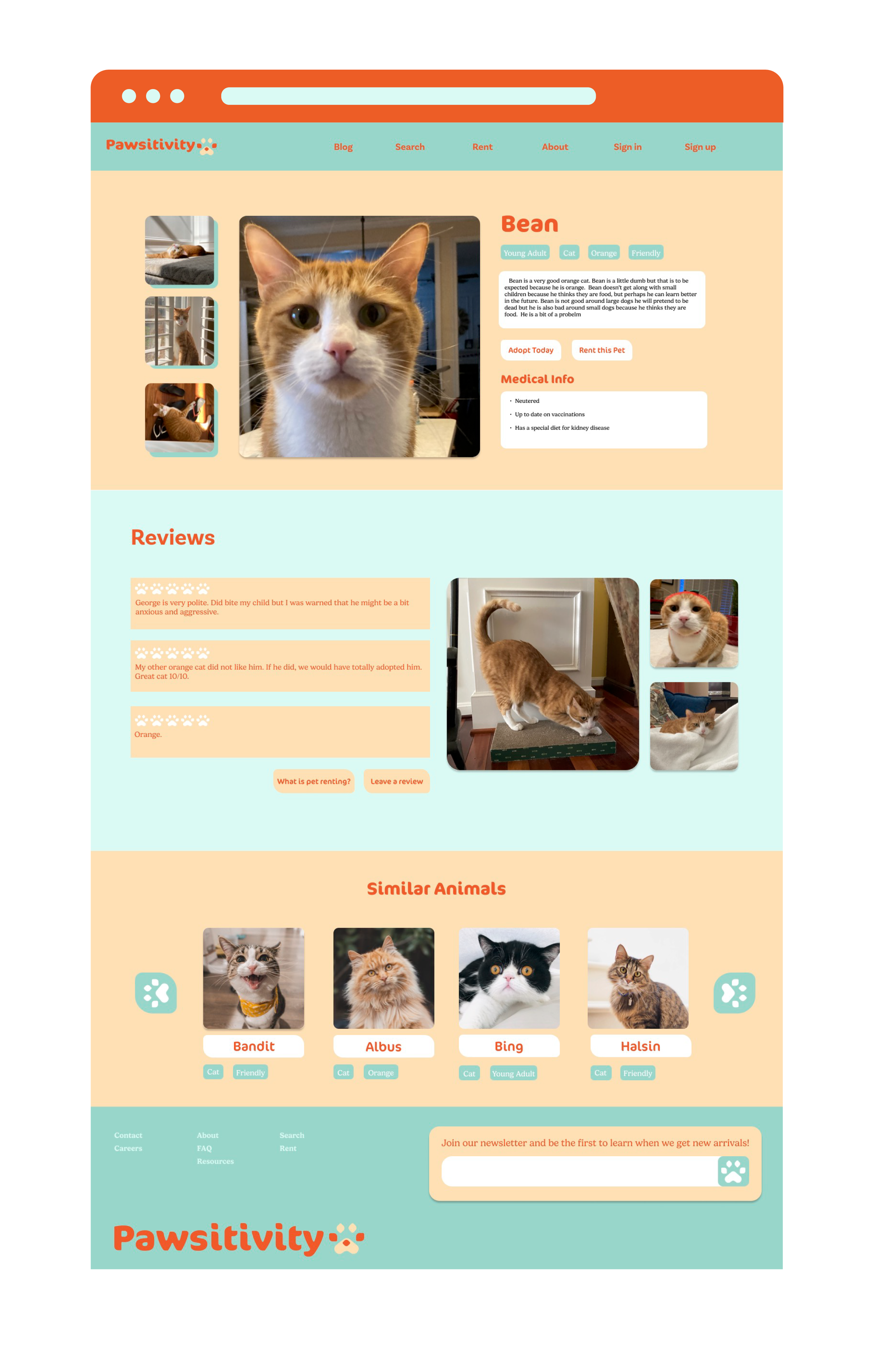
The first steps I took into this project was collecting adoption site websites such as All 4 Paws, Green Street Rescue, Pet Finder, etc. and then filtering through them for aspects I liked or disliked in their UX/UI. I recorded a lot of what shelters believed was important to put on profiles like a pet’s compatibility with other animals, physical characteristics, and temperament. I also interacted a lot with their filtering menus and systems to get a feel for what was more intuitive as a user and what was frustrating.

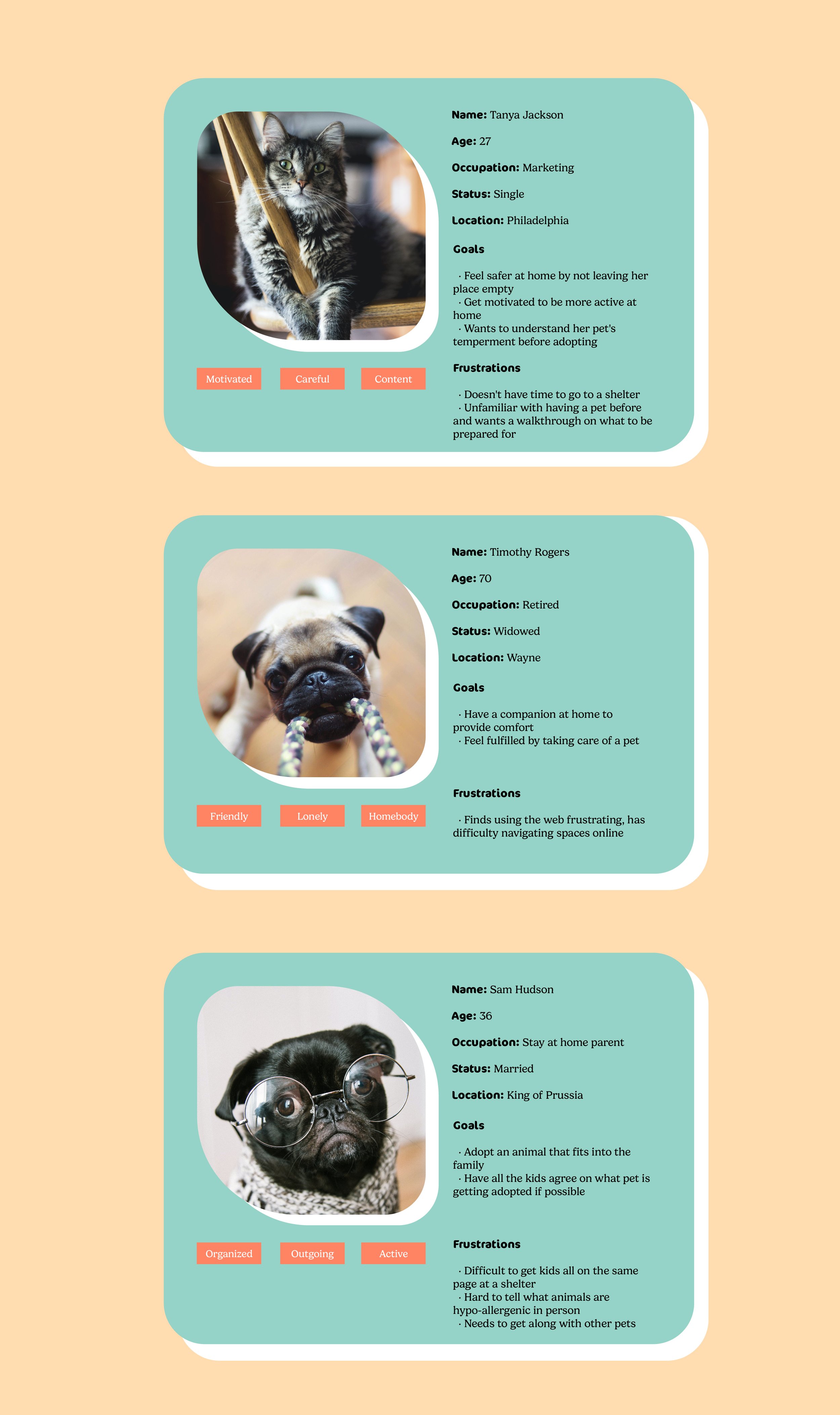
Personas
Following my site research, I also looked considered what other users might look like. 70% of American Households have pets according to the American Pet Productions Association. In addition, 31% of all pets owned in the US are owned by Millennials. With the research I’ve done in mind, I made some user personas. All three have a similar goal in common, adopt a pet, but they all have different reasons for adopting and different priorities in the adoption process. Based off of these personas, what I decided to prioritize in my user flow and design considerations was largely ease of use and an effective filtering system.
Logo Design and Branding
Pawsitivity’s branding was always going to connect to some type of animal motif. One initial design leaned more towards a clinical veterinary feel with the silhouettes of a dog and cat being used as the logo mark and a more clean, formal type paired with it.
Another design direction leaned friendly but also more goofy than playful. The type was round to feel approachable and the logo was mostly just a large heart that with the addition of some lines looked like a big dog nose and some small eyes.
The branding direction I settled on originally was just going to have a paw print for the logo mark, but after messing around with the shapes for the smaller toes I realized it could also be a face. With the right coloring and the addition of the toe shape towards the middle of the face to be a nose, it reminded me of a dog with round eyebrows.
Cocon Pro Bold has a friendly, approachable but not completely unserious tone to it, and also felt very similar to the shapes I was using for the logo mark so it became my main logo type with some slight modifications. I rounded out all of the edges in illustrator and replaced the original tittles with the rounded diamond shape from the paw logo. To stay fun but friendly, I decided on Gelica for my body copy. The round serifs kept the brand soft while still improving legibility for larger bodies of text.