Lyric Book
Typography
•
Print Design
•
Typography • Print Design •
Project Year: 2023
Designer: Brynn Olsen
Art Direction: Paul Sheriff
Randall Findell is a pop/hyperpop artist that produces and performs music under the name “brakence”. This book was intended to explore typography using his lyrics from his song “deepfake” while also working with his existing branding.
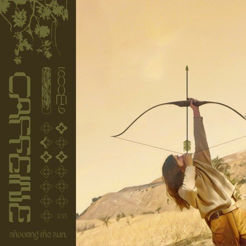
My inspiration for this project was largely drawn from his 2020-2022 album covers preceding his hypochondriac album. Almost all of his covers have photography with a forest or other outdoor background and features more muted or earthy colors.
The title of the album is done in psychedelic or psychedelic-inspired typography, and often accompanied by other graphic flourishes that have some organic shape or theme. The text on the album is always stuck in a colored block around the edge of the cover, and is often running sideways and vertical.
From these examples, I decided to go with a earthy, natural color palette for my book and stick to nature related imagery. I also knew I wanted to use a psychedelic font to stay connected to his typography choices.
Based off of what I observed in his covers, I decided to have brakence’s introductory page feature a photo of himself with the header “who is brakence” running along the side of the page in the Eckmannpsych font. I then had the actual body copy running above the photo of him to mimic his “Punk 2” Album.
I also decided to make the end pages venus fly traps as a reference to another song of his, “Venus Fly Trap”, with the text “bloomtodeath”, a reoccurring lyric in his hypochondriac album, covering the page.
It was also at this early point in designing the book that I knew all my photos was going to receive this duotone photo treatment in order to stay connected and consistent.
After the initial intro page, it was just a lot of listening to “deepfake” and experimenting with the actual lyrics on the next pages. My second spread focused on the intro which was just the repeating line, “I am using my imagination.” I decided to blow it up across the page and accent it with with ornaments from Matrix II.
The following spread I found a lovely photo of some mushrooms, so all the text went vertical in order to accommodate the full height of the photo.
The third spread I emphasized certain lines of text with Eckmannpsych and manipulated the placement of the photo in order to interfere with the text as little as possible.
The final page uses only a single small photo of mushrooms that a line of text partially sits on top of. The space is also broken up by a faint green block of “bloomtodeath” text on the bottom left side of the page.
Overall, I really enjoyed this project. It was a really fun way to explore typography while also challenging myself to stay connected to brakence’s brand. In the future, I’d love to do this again with other songs from this album. At the time I was working on this piece, I was not comfortable with illustration but I think now I would be more willing to try and include some similar to what’s incorporated in his music videos and album covers. I also think that I’d like to attempt to create my own hand lettered font for the cover rather than manipulating a pre-existing one if I were to re-visit this project.


