
the shadows stay
Experience Design
•
Typography
•
Experience Design • Typography •
Project Year: 2023
Designer: Brynn Olsen
Art Direction: Dermot Mac Cormack
“the shadows stay, a history of hiroshima” is the title of my fictitious exhibit on the bombing of Hiroshima. The focus of the exhibit was educating a general audience on the tragedy. This concept was inspired by a Time article titled, “After the Bomb”, which was a collection of interviews with Hiroshima and Nagasaki survivors. Text and imagery was taken from this article, along with other sources such as the Hiroshima Peace Memorial Museum and other databases.
Title and Logo
The first step in this project was title discovery and logo creation. After trying out multiple different image based logos and researching a lot of poetry post-Hiroshima, I decided on a type based logo. The title originates from a poem titled, "Hiroshima" by Sachchidananda Vatsyayan or Agyeya. The shadows referenced in the poem are from people or objects around when the bomb went off, etching their shadows into their surrounds as everything not covered is bleached from light. The line “the shadow stays” felt like the most respectful way to reference the event rather than imagery referencing the shadows.


Catalogue
Another element of this project I worked on was a catalogue. The intended form for the catalogue would be a long, fold out pamphlet to mimic calligraphic scrolls. As a result, there are two long spreads that make up the catalogue that have multiple panels. The body copy consists of excerpts from the Time article, “After the Bomb”, along with some copy writing I came up with and other sections from Chat GPT that I edited and proof read. A lot of the imagery was found through databases or other articles talking about the Hiroshima and Nagasaki disasters. The calligraphic writing seen is directly from the Time article mentioned earlier with some slight re-coloring to match the brand.
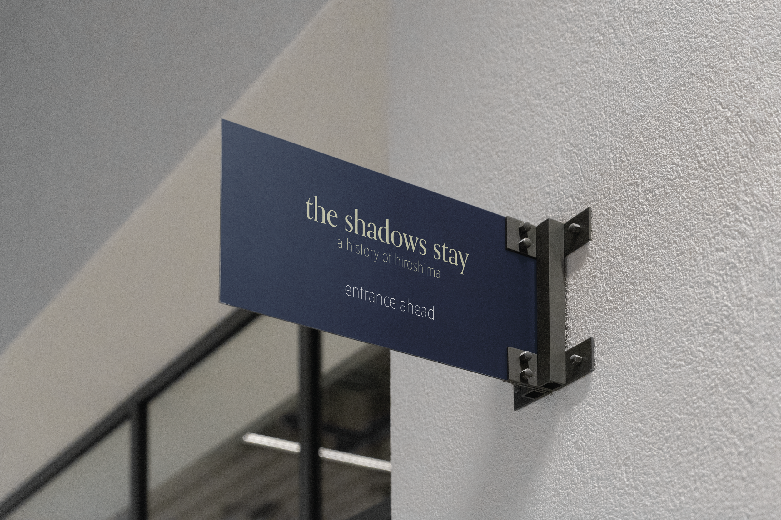
Wayfinding
The next part of this project I worked on was way finding elements, which ended up being a lot of different signage. I incorporated imagery I knew I wanted to show in my catalogue and figured out some more elements of my branding while trying to solve my way finding problems. Any issues I had were mostly layout based and were solved with time and experimentation.


Stationary
After deciding up the title and type logo, I designed some business cards and stationary to help figure out more about the brand. This process helped me decide on color combinations, finalize font choices, and get a better feel for how formal my exhibition brand should be.


